

ONLINE MARKETING JUST GOT WAY EASIER.
(at least according to the 40,000+ folks we've helped so far...)
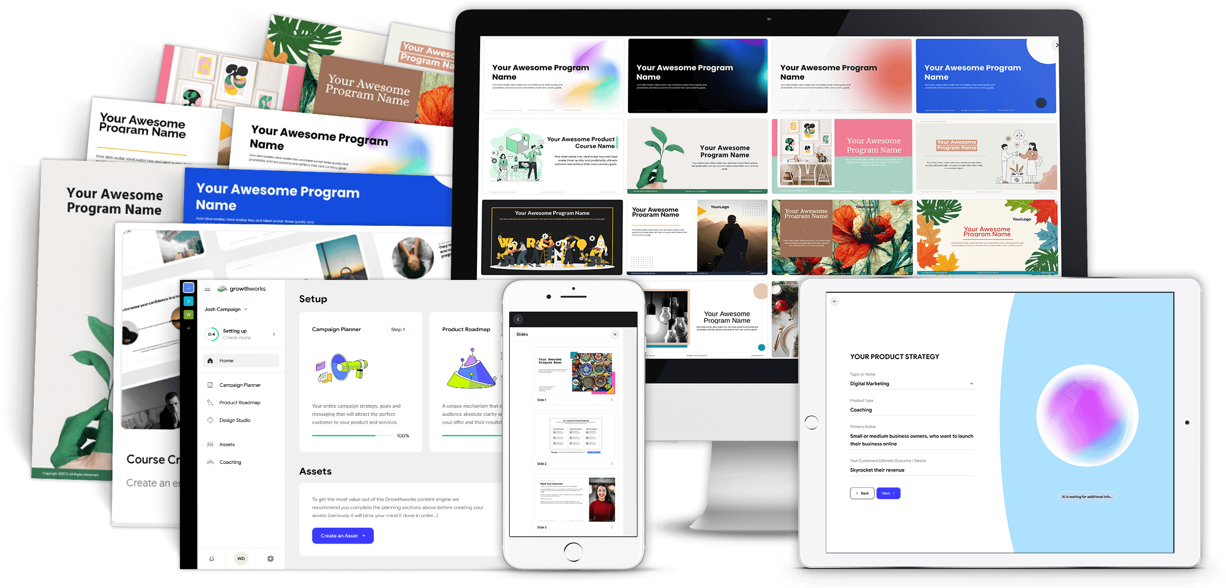
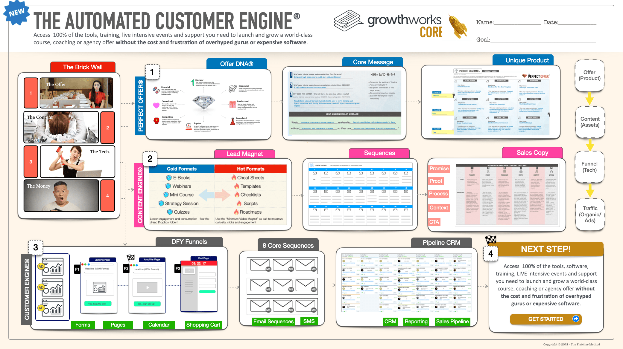
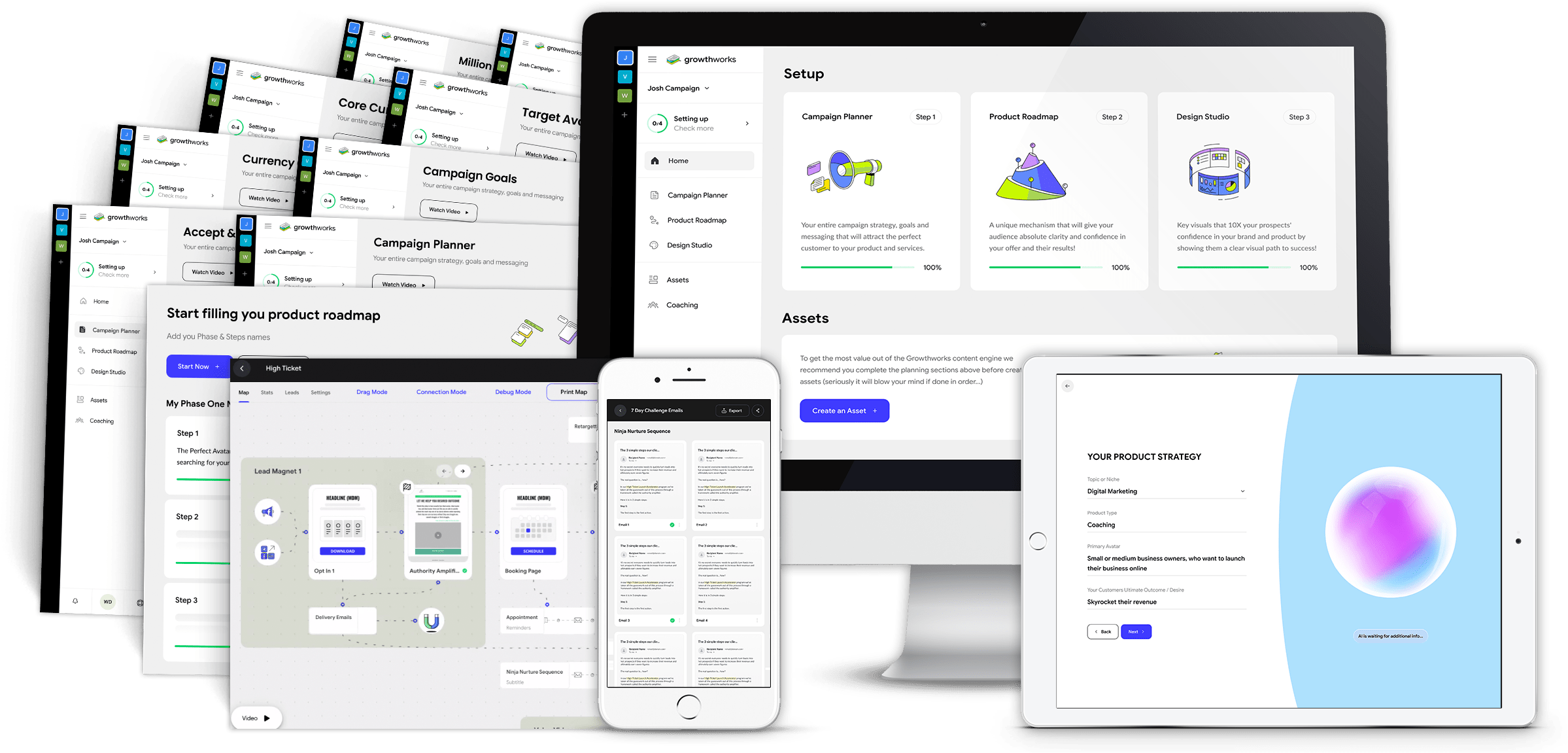
The All NEW Automatic Course Creator Platform!
The Growthworks Course Creator helps you map out and build your an entire premium course in a small fraction of the time, including your title, messaging and modules, all 140+ slides and so much more...
(Total Value: $1997.00)
Included In This Amazing Offer!

THE BOOK
Over the years, I have been asked countless times by clients to recommend a good book that served as a “primer on online marketing.” Each time, I saw the overwhelm that quickly ensued as I produced an encyclopedic list of works on social media, search engine marketing, blogging..ad nauseam. There wasn’t a single resource for busy business owners in desperate need of an introductory book on online marketing. Until now…
THE MASTERCLASS
Be the First to Experience the All New Growthworks CRM® - Including Done-For-You Funnels, Email Sequences, Calendars, Shopping Cart and More...All using our patented Growthworks Product Methodology and Content Systems - (And a Few Surprises You Won't Want to Miss!)
Special Update!
Growthworks AI is LIVE!
"Watch me create an entire premium course (modules, content, slides) and marketing system (messaging, audience, pricing, lead magnets, email sequences, pages and more)...IN MINUTES!"

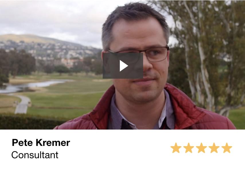
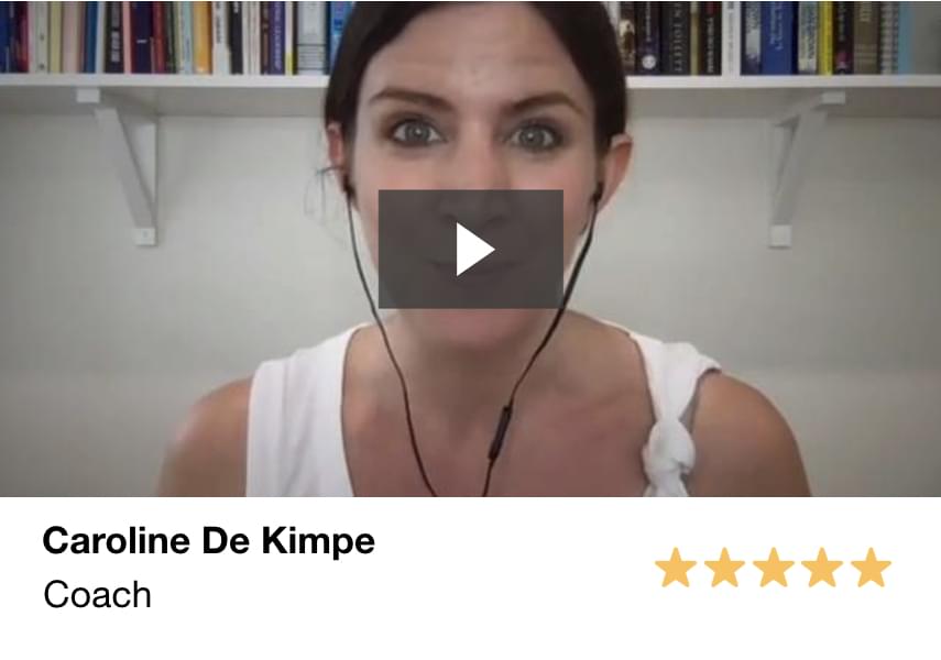
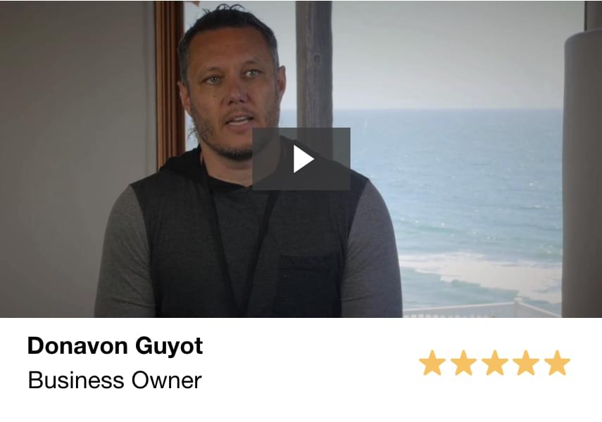
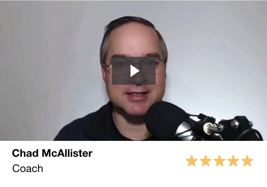
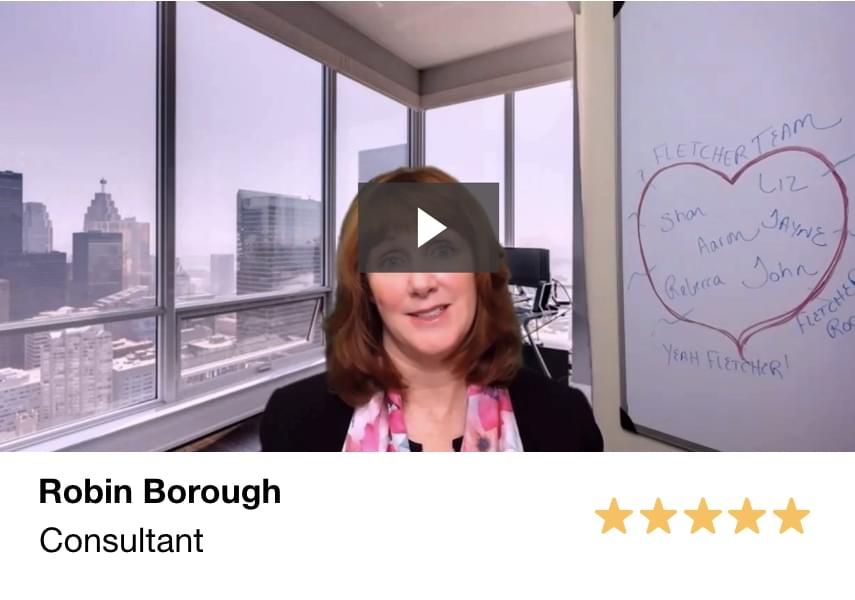
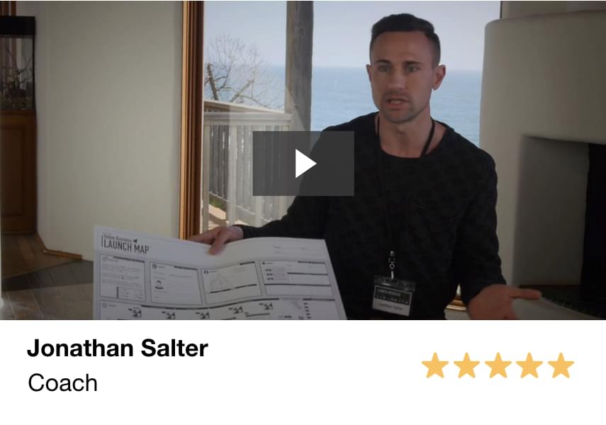
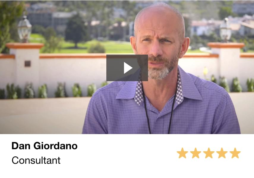
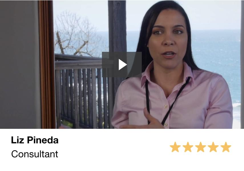
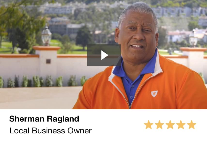
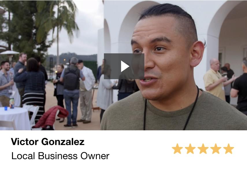
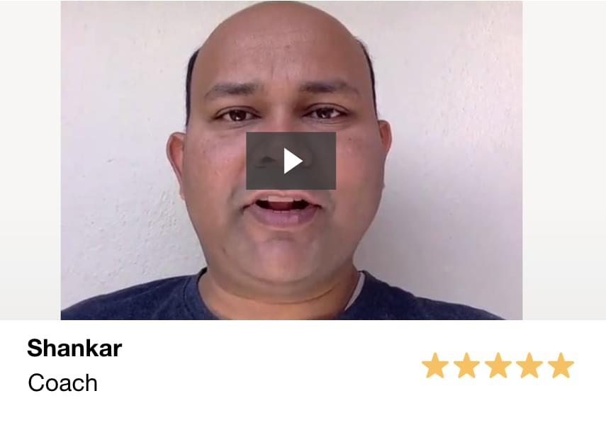
THE RESULTS
The unequivocal, indisputable best part of what we do is receiving feedback like this from the thousands of awesome clients we help go from frustrated, overwhelmed and fed-up to confident and happy marketers each and every day...

DISCLAIMER: The sales figures stated above are our internal sales figures. The average person who buys any “how to” information gets little to no results. I’m using these references for example purposes only. Your results will vary and depend on many factors …including but not limited to your background, experience, and work ethic. All business entails risk as well as massive and consistent effort and action. If you're not willing to accept that, please DO NOT GET OUR INFORMATION.
This site or product is not part of or endorsed by Facebook, Google, or any social media platform in any way.
FACEBOOK is a trademark of META PLATFORMS, Inc. YOUTUBE and GOOGLE are trademarks of ALPHABET, Inc.
Absolutely nothing on this web page should be considered as any type of earnings claim for what you will earn simply by joining.
This is an ONLINE TRAINING COURSE intended to help BUSINESS OWNERS and ADVERTISERS learn how to get more customers for their products. It is NOT a “business opportunity” or “get rich quick” opportunity.
The testimonials, figures, and screenshots on this page are real but they are displaying exceptional results from our best customers. These results are not typical. They are not intended to guarantee, promise or represent that you will get the same result just by signing up.
This will require work and you will be the ultimate person responsible for taking action and making sure you get the results that you want.
Copyright 2023 - The Fletcher Method - PO BOX 2183, RANCHO SANTA FE, CA 92067, United States